
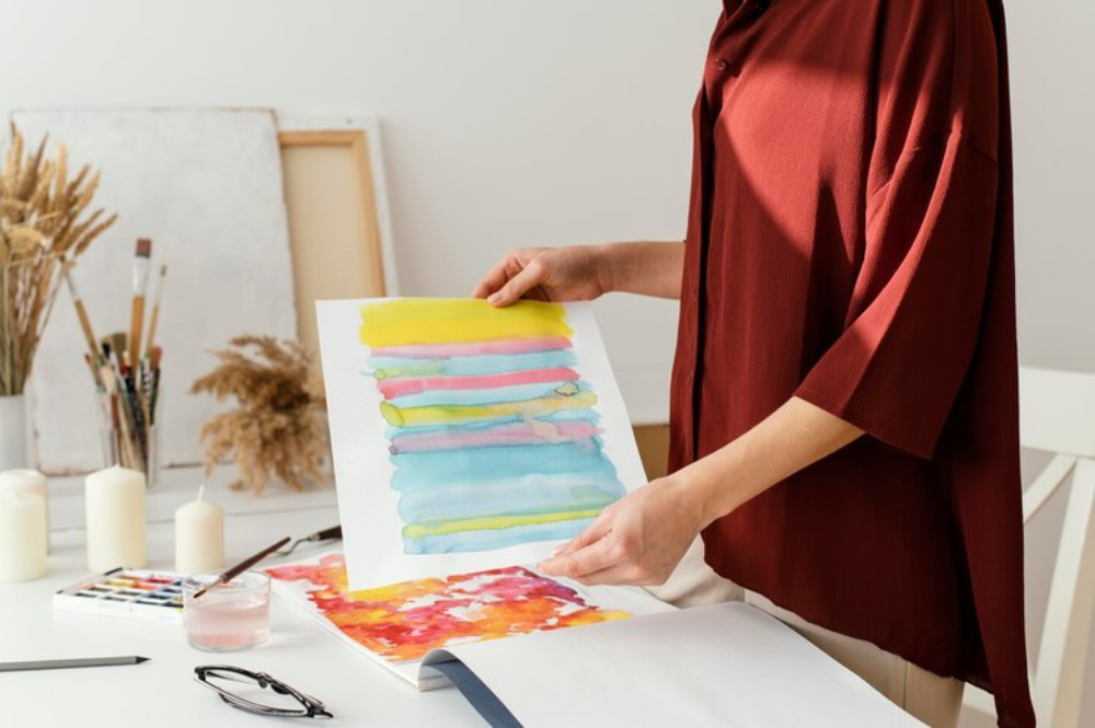
In the dynamic world of digital design and printing, achieving vibrant and accurate colors is both an art and a science.
Whether you’re creating marketing materials, art prints, or personal projects, mastering the intricacies of digital design and printing can significantly enhance your results.
In this article, we’ll delve into practical tips that empower you to produce stunning, true-to-life prints without compromising quality. From color calibration to paper selection, let’s start on a journey to elevate your printing game.
Design Considerations
When preparing your digital files for printing, thoughtful design choices play a pivotal role. Here’s what to keep in mind:
Layout and Composition: Craft a well-organized layout that guides the viewer’s eye smoothly. Balance elements, use whitespace effectively, and ensure readability.
Color Harmony: Choose a color palette that resonates with your brand identity. Consistent color usage across your materials reinforces recognition and professionalism.
Resolution: High-resolution images are essential for crisp prints. Aim for at least 300 DPI (dots per inch) to maintain clarity.
File Preparation
Properly prepared files are the foundation of successful digital prints:
File Formats: Confirm whether your printer prefers PDFs or native application files. Some printers may require proofs or mockups.
Graphics Optimization: Ensure your graphics meet color and compression requirements. Compressed images can lose quality, so strike a balance between file size and clarity.
Font Handling: Embed all necessary fonts in your files to prevent font substitution issues during printing.
Printing Settings
Selecting the right printing settings is crucial for optimal results:
Color Profiles: Choose the appropriate color profile (such as CMYK for print) to ensure accurate color reproduction.
Paper Selection: Consider the type of paper or substrate you’re printing on. Different papers yield varying results in terms of texture, finish, and color vibrancy.
Print Quality: Adjust the print quality settings based on your desired outcome. Higher quality settings generally result in better prints but may take longer.
Material Compatibility
Digital printing accommodates various materials beyond standard paper:
Canvas: Ideal for art prints and reproductions, canvas provides a textured surface that adds depth to your visuals.
Synthetic Materials: Explore synthetic options like vinyl or polyester for durable outdoor signage or banners.
Specialty Papers: From glossy to matte, textured to metallic, specialty papers offer unique finishes that enhance your designs.
Color Calibration and Proofing
Achieving consistent color reproduction across devices and printers is essential:
Calibrate Your Monitor: Regularly calibrate your computer monitor to ensure accurate color representation. Use hardware or software tools for precise adjustments.
Soft Proofing: Before printing, use software like Adobe Photoshop to simulate how your design will appear on paper. Soft proofing helps identify potential color discrepancies.
Test Prints: Always create test prints before large-scale production. Evaluate colors under different lighting conditions to catch any unexpected shifts.
Maintenance and Storage
A well-maintained printer yields better results:
Clean Printheads: Regularly clean printheads to prevent clogs and ensure consistent ink flow.
Replace Consumables: Replace ink cartridges and maintenance kits as recommended by the manufacturer.
Avoid Sunlight: Sun exposure can fade colors over time. Keep prints away from direct sunlight.
Control Humidity: Extreme humidity can affect paper quality. Store prints in a controlled environment.